Z Score,T Score, Percential Rank and Box Plot Graph
5music mag colour schemes
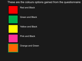
1. These are the colours options gained from the questionnaire: Red and Black Green and Black Yellow and Black Pink and Black Orange and Green
2. This is how the colours could be used for the masthead on the front cover: ZOOP ZOOP ZOOP ZOOP ZOOP
3. This is how the colours could be used for the main body of the text: This is how the colours would be used for the main body of the text This is how the colours would be used for the main body of the text This is how the colours would be used for the main body of the text This is how the colours would be used for the main body of the text This is how the colours would be used for the main body of the text
4. This is how the colours could be used for the special offers on the font cover: Special Offer Special Offer Special Offer Special Offer Special Offer
5. These are the reasons why each colour has been picked or not: Red and Black has been picked because out of all the colours it stands out the most and it will draw attention to the magazine, it was also the favourite colour picked in the questionnaire. Green and Black has not been picked because in the body of text the text is hard to read in black or white and it doesn’t stand out as much as other colour do. Yellow and Black has not been picked because in the body of text the text is unreadable in white and the masthead doesn’t look as good as it dose in other colours. Pink and Black is not been picked as this will cause some people to ignore it as pink is considered a girls colour and the masthead doesn’t look as good as it dose in other colours. Orange and Green is not been picked even though it dose draw attention to itself it isn’t the best looking and only one person picked it in the questionnaire.
6. From this I have decided to use Red and Black ZOOP This is how the colours could be used for the main body of the text Special Offer